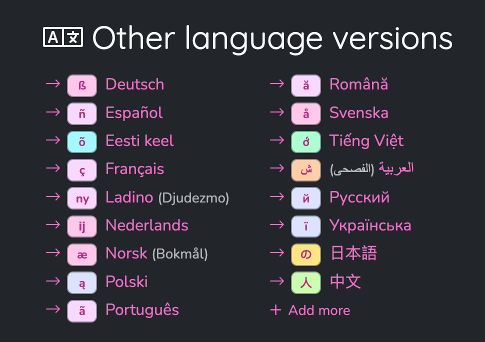
Graphical representation of languages?
2024-08-18 | @andrea
Placing graphical elements next to text labels is a cool design trick – it helps your brain skip a few steps when navigating a user interface: instead of reading the label it can immediately know what a button is doing just by glancing at the icon.
That's the reason why most buttons on our website have a corresponding icon – and you can only imagine how much easier it makes the work on the project! I can easily navigate any language version without understanding a single word of it, just because I remember which icons are marking which button.
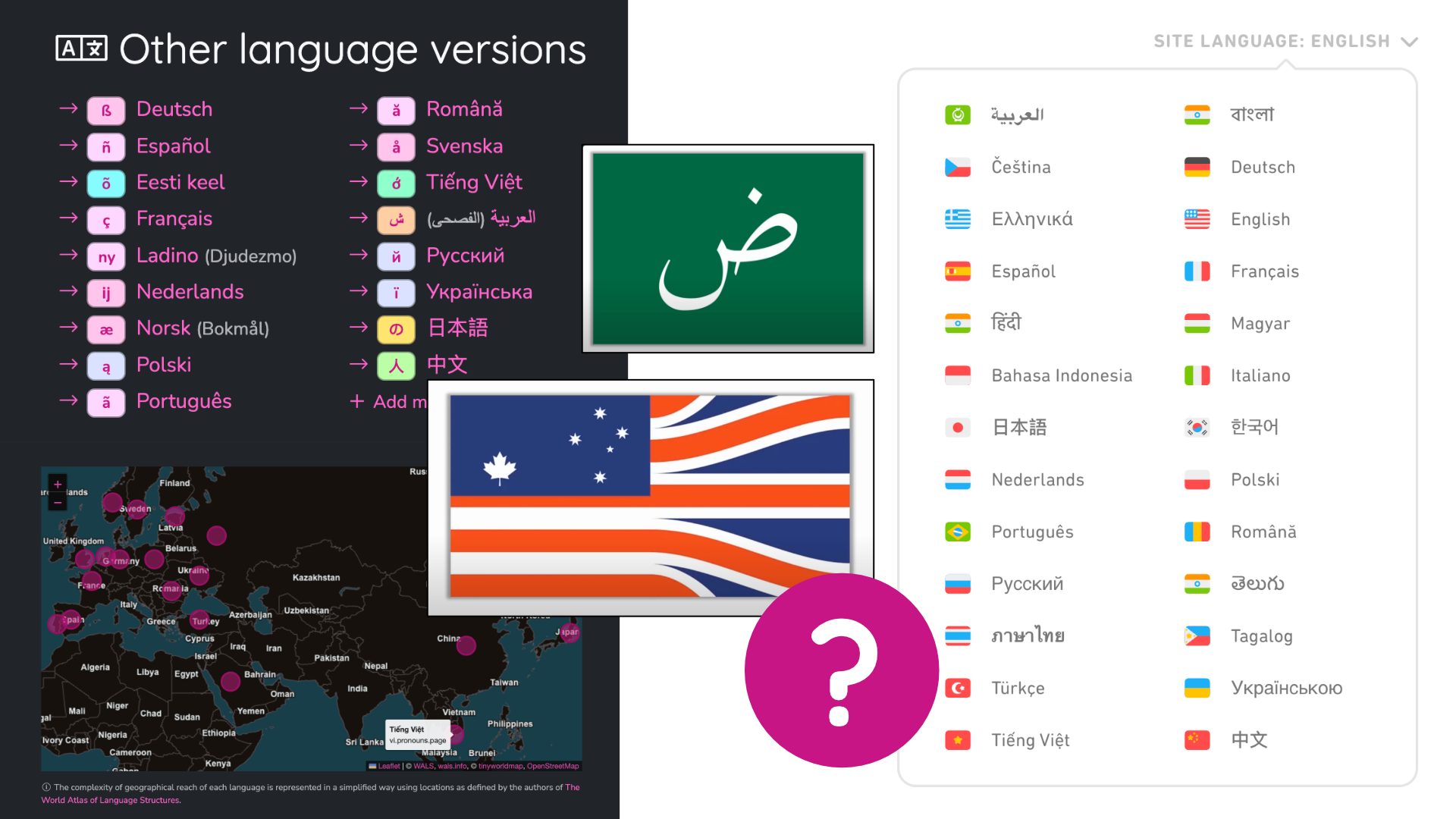
It's also a reason why many user interfaces put flags next to language names. Is it really a good approach, though? After all, flags represent countries, not languages – and if the ideological and political complications of mixing up those two concepts don't convince you, the practical issues hopefully will: languages simply cannot be mapped one-to-one with countries.
First example that comes to mind: which flag should represent English? It originated in 🏴 England, but it's also spoken / official in the rest of the 🇬🇧 United Kingdom, in the 🇺🇸 United States, 🇦🇺 Australia, 🇨🇦 Canada, 🇮🇳 India, and many others. Why would we pick one over another? If we go with place of origin, would most people even recognise the flag of England? If we go by population size, wouldn't the flag of India make people think of Hindi rather than English? Similar issues arise with other languages. Which flag should represent Spanish? 🇪🇸 Spain, 🇲🇽 Mexico, 🇦🇷 Argentina, 🇨🇴 Colombia? Which flag should represent Portuguese? 🇵🇹 Portugal, 🇧🇷 Brazil? Which flag should represent Arabic? 🇸🇦 Saudi Arabia, 🇪🇬 Egypt, 🇮🇶 Iraq, 🇱🇧 Lebanon?
Many languages aren't recognised as official languages of any country. Some groups of speakers, like Silesians or Basques, have a flag for their region, but others, like Ladino speakers, don't – they don't even occupy a single region. Some constructed languages might have a flag, like Esperanto does, but others simply do not. And even if a good candidate for a flag exists, it might not be universally accepted by the speakers of the language, and it might be harder to use – for example, I was able to easily add country flag emojis to this text, but embedding an Esperanto or Basque flag in a text would require way more effort.
People have been designing flags that would represent languages better than country flags – for example by combining elements of flags of countries where the language is spoken. Here's a fun video exploring a bunch of ideas:
As the number of language versions of our project grows, we've been discussing ideas to make it easier to find the one people are looking for
– without using country flags.
I've created a proof-of-concept for an approach in which we pick a single grapheme from a language that can represent it –
for example ß for German, ñ for Spanish or ą for Polish – and we put it on a background colour that represents the language family –
like Germanic, Romance or Slavic, respectively.
This approach is not ideal either. It's still a very arbitrary choice: why not use ł for Polish? Should Swedish get å, or should Norwegian?
The English alphabet is quite boring, should we just pick a random Latin letter, or maybe take a risk of not being understood and use historical þ?
Those graphemes are admittedly less recognisable than the flags we're used to seeing representing languages –
while it might be a good idea in a long run, it doesn't really help much in the short term.
Another approach we've been looking into was using a map. While speakers of any language might be located literally anywhere, it is generally possible to mark a general area where the language is commonly spoken. Unfortunately, finding an open source dataset of those areas is not easy, and even if we had it, we'd still need to deal with issues like overlapping territories, or some areas being too small to click on while others would span across continents. Instead, we tried using a dataset of simple lat/long coordinates for each language from The World Atlas of Language Structures, each language being represented by a single dot on a map, in a general “centre of gravity” as picked by the linguists who created that dataset. But we're still not really getting rid of the main problem with mixing up languages with countries – while it might help Polish speakers quickly find and click on the dot in the middle of Poland, for users from the US it probably wouldn't be obvious to look around England. And where would we even put Esperanto or Toki Pona?
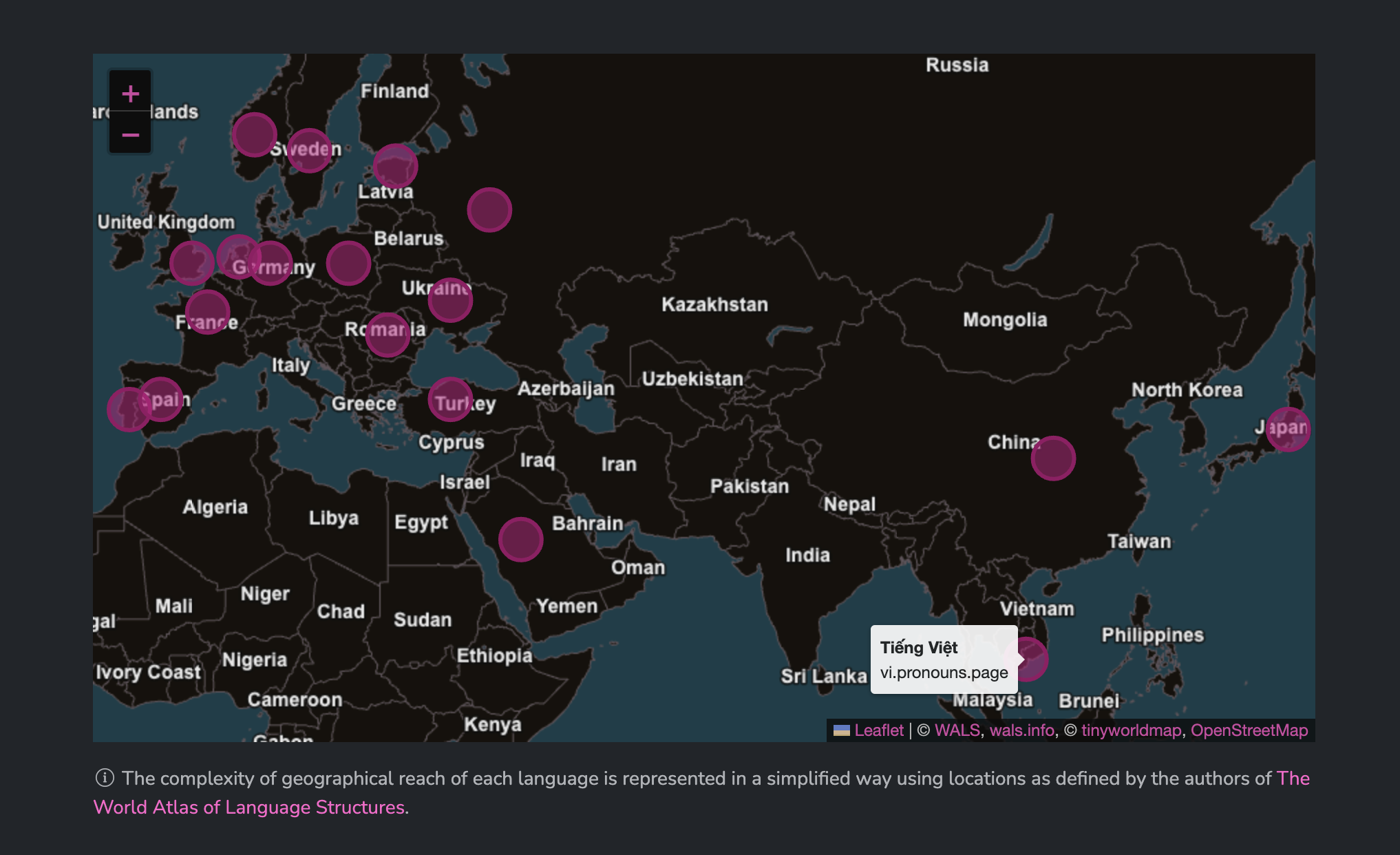
This map is not supposed to be an accurate mapping of languages, the idea was not to draw out where exactly each language is spoken – that's a very difficult thing to do (and also not our job). The map was supposed to be just an extra tool to help with the overwhelm when visiting the page and seeing an ever-growing list of languages without any graphical helpers (like flags). It would allow some users to immediately find the language they're looking for by just glancing on a map – while others could still fall back to the simple list of languages. But ultimately, we decided that this approach is too far from good to be actually put on the website.
What we ended up implementing on the main homepage at pronouns.page, is simply adding a few helpers to the existing “raw” list of languages. We can use the list of preferred languages as specified by the user in their browser settings – and show a few suggestions on top; this way it's very likely that they'll see what they're looking for right away. Underneath there's a full list without any extra graphical elements, but now it gets a filter – one can just start typing the name of the language they're looking for (either endonym or exonym) or its ISO code – and they'll find it right away.
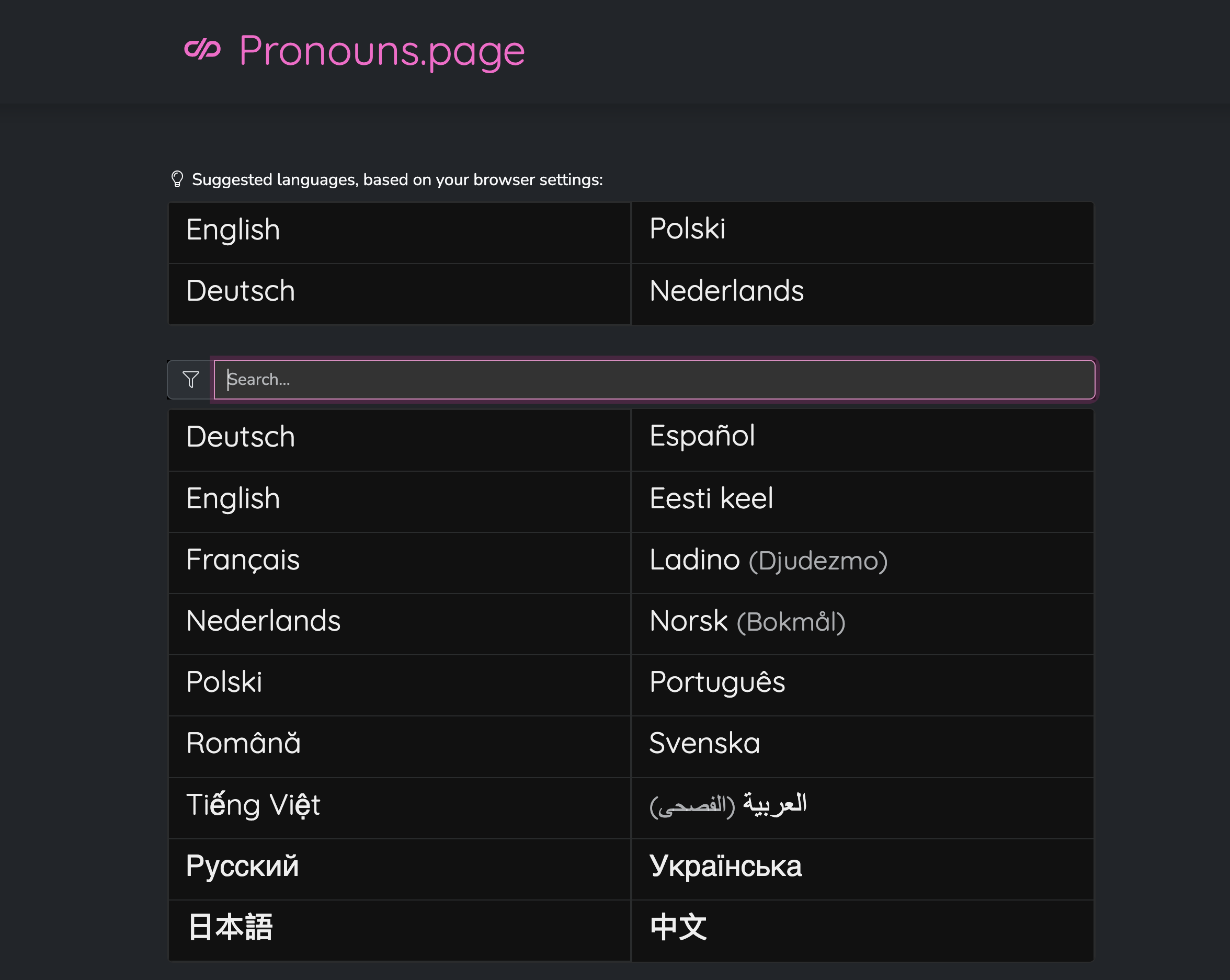
The list isn't perfect either. How do you even sort languages alphabetically if they use different scripts? You could use the romanisation of their names, like Wikipedia does, but it's still a bit eurocentric and doesn't account for languages with multiple romanisations like Thai. We could sort the languages by popularity (eg. number of cards in our database), but while it would make it more likely to easily find your language for more people on average, it wouldn't actually make it easy to find in general. For now, we've been treating Latin and non-Latin scripts differently, due to the composition and popularity of the languages currently present, but that's likely to change with more versions coming.
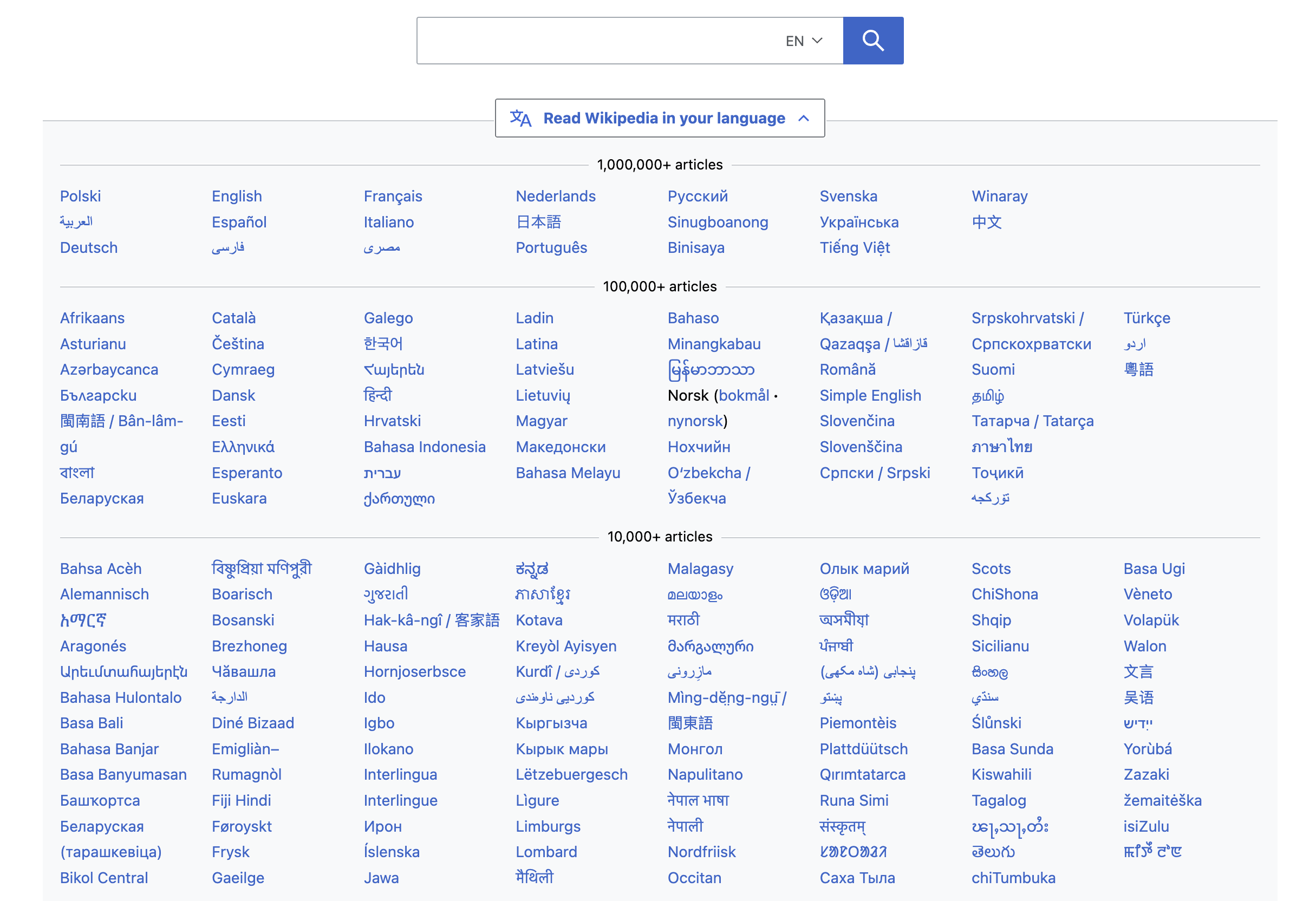
Of course, we're nowhere near Wikipedia. With 18 language versions of Pronouns.page currently published, all of that is not a massive problem, people can easily scan the whole list and find what they're looking for. But considering that there are also 47 language channels on our Discord server, in various stages of completion, the question will become more pressing with time. But even if it doesn't – isn't it fun to explore and discuss all of those ideas?
So, what do y'all think about this issue? Do you have better ideas? Is there an approach that would solve all the issues and become a useful standard for listing languages in user interfaces? We're very open to experiments!
React:
Share:


